Greetings!
Our favorite Italian has created this lovely website and somehow I've talked him into granting me some space to share some of my mapping opinions. Big mistake, htprankster!
Before I dive in to the topic at hand, let me share a bit of my background. I was first exposed to Quake 3 in the mid 2000s by movies like Annihilation (by Ownage) and Lyon Connection (by TomBoss). Inspired, I installed the game and then later started playing CPM and Defrag. From there, I joined the Reflex bandwagon when the Kickstarter was first announced and became the most annoying supporter of Reflex amongst CPM players after it moved to EA on Steam. Eventually, I started playing more race mode in Reflex and began my race mapping experience with my first map, Encounter the Monolith. Prior to that first experience, I had dabbled a little bit with GtkRadiant while trying to make duel maps.
I'd consider myself a 1v1 player primarily, but spent enough time making maps over the years that I figure someone might find value in the two cents I share below.
Rookie Mistakes
My first race map – Encounter the Monolith – was pretty much a giant time sink. I made all the typical newbie mistakes by using a really low snap distance and focusing on perfecting one section at at time rather than a normal block out phase. But ultimately what I was hoping to achieve was two things: (1) Create a multi-path map that could be completed by nearly any skill-level, and (2) get a bit of that creative release when you see something grow and develop over time.
Pathfinding
In the first regard, I think I succeeded. I created multiple, feasible paths from the start to the end, with each being progressively harder. The easy path was by far the longest, the medium difficulty path, a little bit faster/shorter, and then hard path was very short (and also slightly hidden).
However, I made a critical error in designing that final, hard path. The hard route could only be completed within a very narrow range of position and speed. I would guess that if you superimposed the top 10 runs on Encounter the Monolith, that they would all be virtually identical except for some small bits of efficiencies here and there. In my opinion, that is less than ideal because we the final time should clearly distinguish players, rather than come down to literal frames of difference.
Looking back, I realize there were things I could've done to avoid that situation.
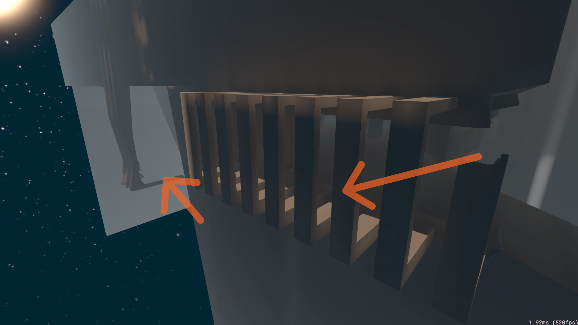
When we create a space for players to navigate through, there will be a range of routes and speeds that players travel. I'm sure there are genius mappers out there who can visualize and expertly measure these things. They can probably visualize where a player may be landing at a certain speed on a certain route. Since I cannot do that myself, I use a crutch to help: give players more space to work with.
More space might mean giving more horizontal space. Imagine a completely open, flat area. There's basically nothing that will slow them down except for their own efficiency with movement and the game's physics. As you begin to constrain that space, the player's options become fewer. In a tight corridor, you can widen or narrow it to put constraints on their ability to position. This was very obvious to me as a new mapper working on Encounter the Monolith.
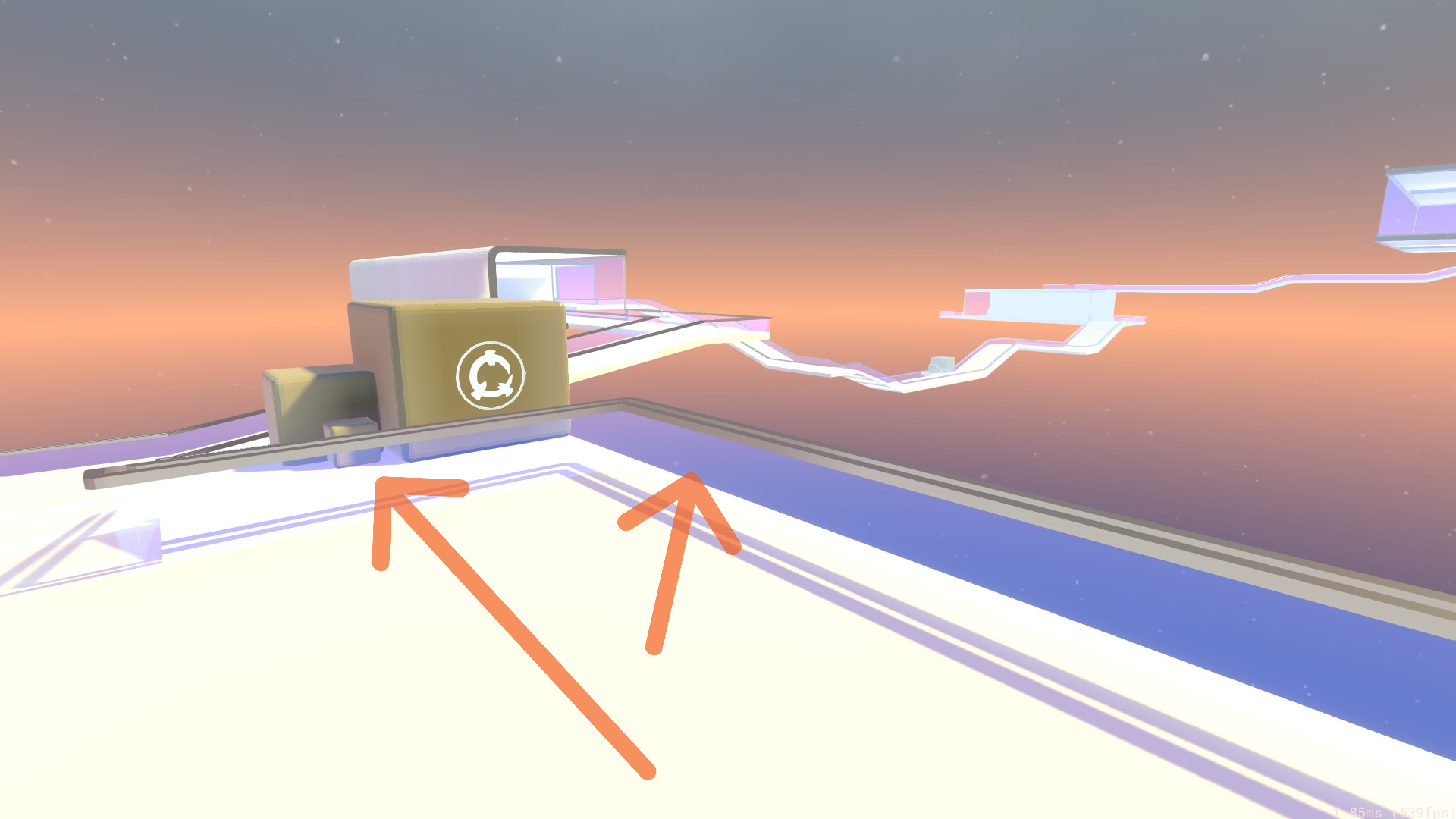
But more space might also mean vertical space, too. And it took me a while to recognize this. When we introduce double/triple jumps, ramps/slopes, or drops, this also creates a new tool for players to reposition themselves. On Aeronaut, there is a rail that goes the entire way around the map that can be used at many places to reposition one's self. This led to incredibly fast, map breaking times.
In my view, these spacing techniques can be done at pretty much any point in a map. But I find them to be the most effective in places that are a little bit before – think 1 or 2 beats – before particularly difficult turns.
Creativity
Probably what I enjoy most about mapping is the creative aspect of it. Race mode, in particular, is unbound by the normal constraints of mapping for modes like 1v1 or CTF. In my opinion, race mode is so enjoyable by itself, it actually takes a fair bit of effort to make it not fun. You would really have to mess up the spacing to make a map unenjoyable. Even then, you'd probably still have the torture map enjoyers playing...
My creative approach is usually dependent on a motif of one sort or another. Whether that be the use of particular color palettes (CRSTL Runner or DRGN Runner), or colossal structures (Encounter the Monolith), trying to replicate some other mapper's style (Mistress, my homage to rekk0r), or trying some new visual (Synthcity).
My creative approach revolves around some basic techniques, explained below.
First, consistency is very important, in my opinion. Keeping a consistent style throughout the map gives it a coherent character and will guide you through whatever creative challenges you face while making it.
Second, make the spaces in the map visually clear. That means adding contrasting colors/value in areas where you have walls or ramps. If you have a wall and floor meeting, and they are the same color/value, it will not be obvious where the floor ends and the wall begins. This is especially important in a game like Reflex where we do not have "textures" in the normal sense.
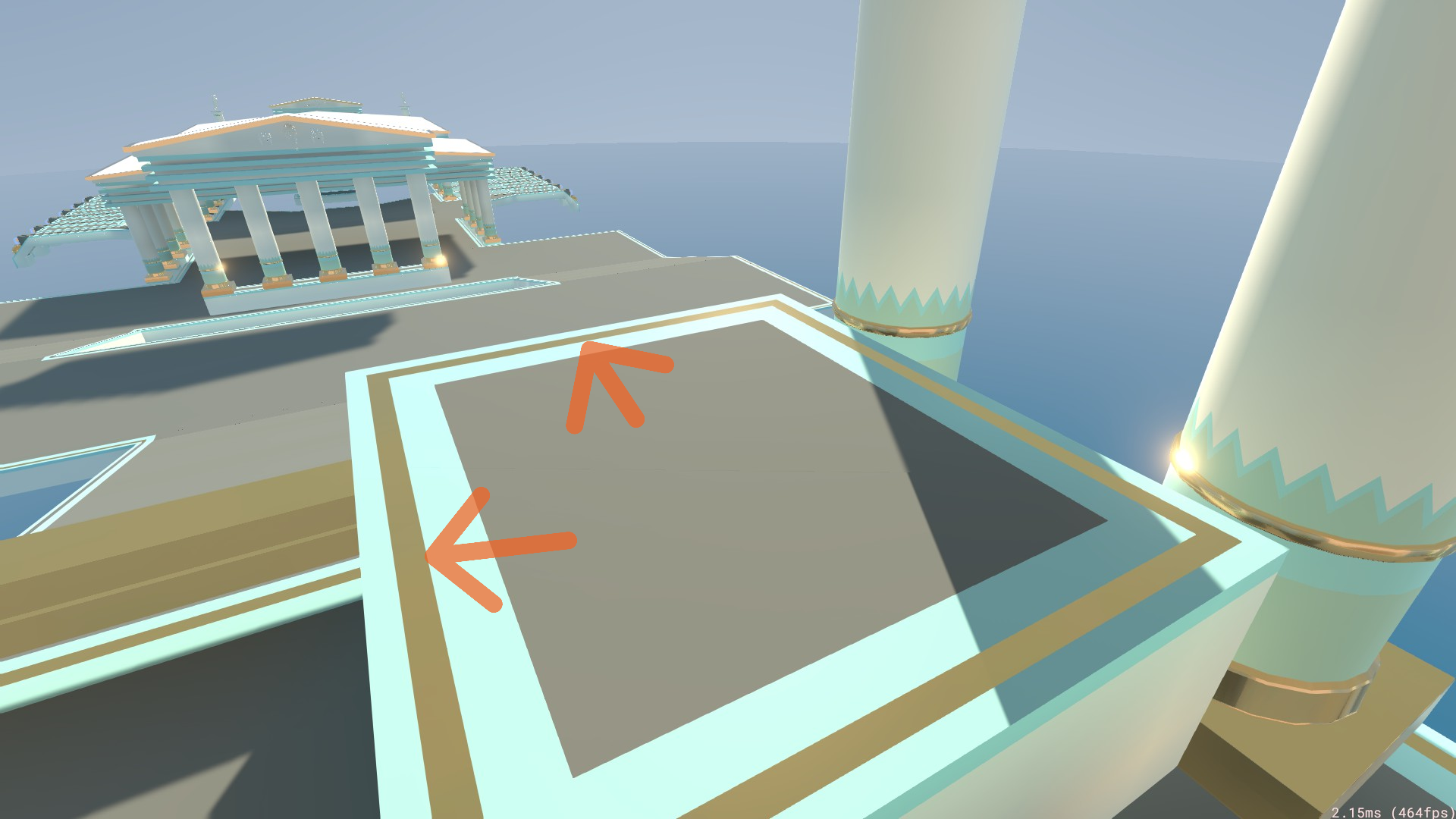
Add little baseboards to walls and borders around floors to make it visually clear what the geometry of the space is. Neptune is a downhill map where you can be moving very quickly by the end. To distinguish the slopes/edges, I used a triple border on all the floors/ramps throughout the map.
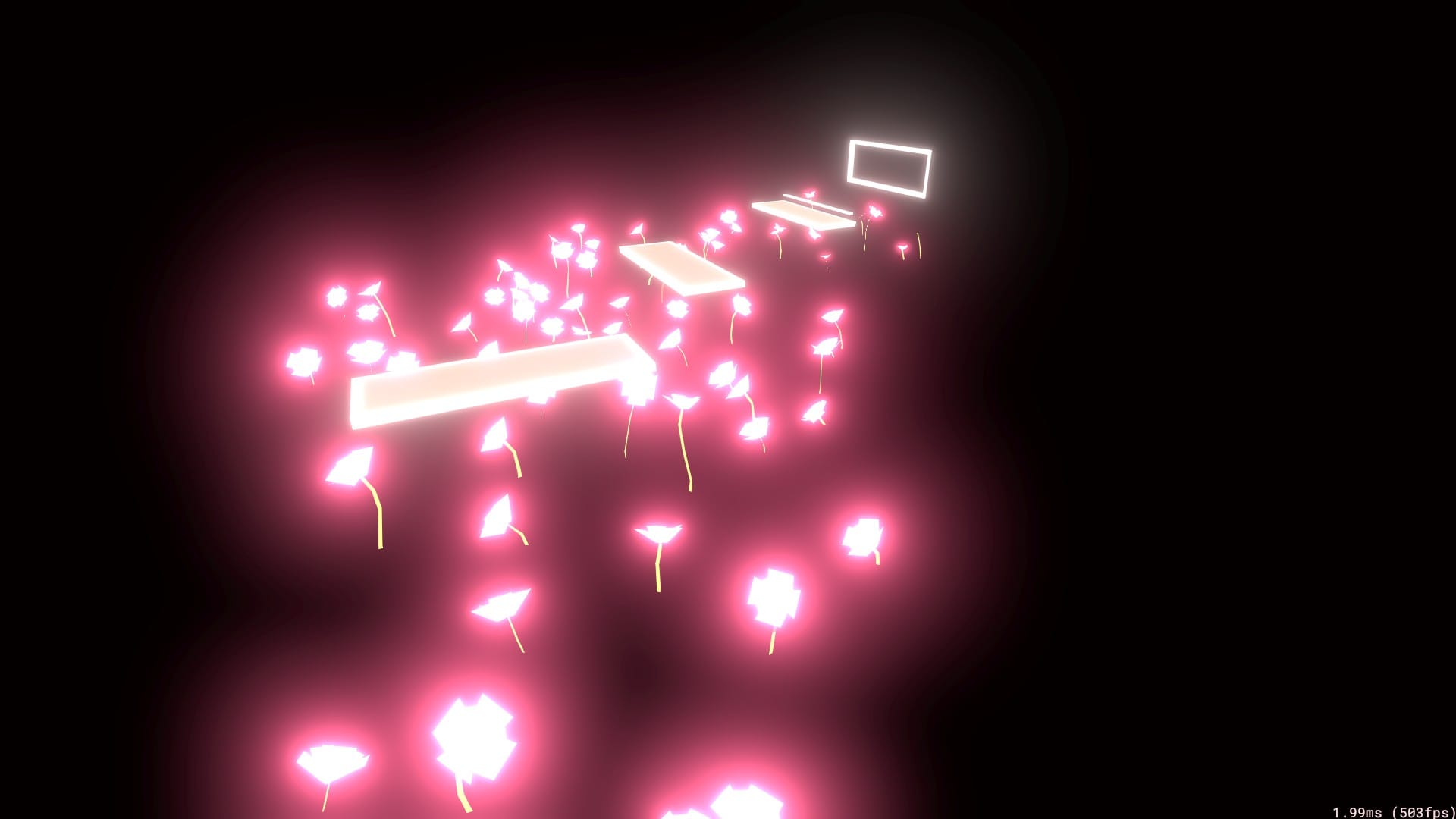
Third, I'm going to be weirdly contradictory with technique #1 here, but don't be scared to break visual consistency. Save some complimentary or contrasting visual for a particular moment(s) on your map. In Surf City, for instance, there is a major visual shift halfway through the map, while still keeping some of the same, retro arcade vibe.
Fourth, use what I call "exhibits" to break up monotony. Many of my maps include these, but Sewers and Dark Fortress have many examples. These are typically smallish spaces with a fair bit of complexity to them. Even adding a stack of boxes in a corner is what I'd consider an "exhibit". Behold, some boxes!
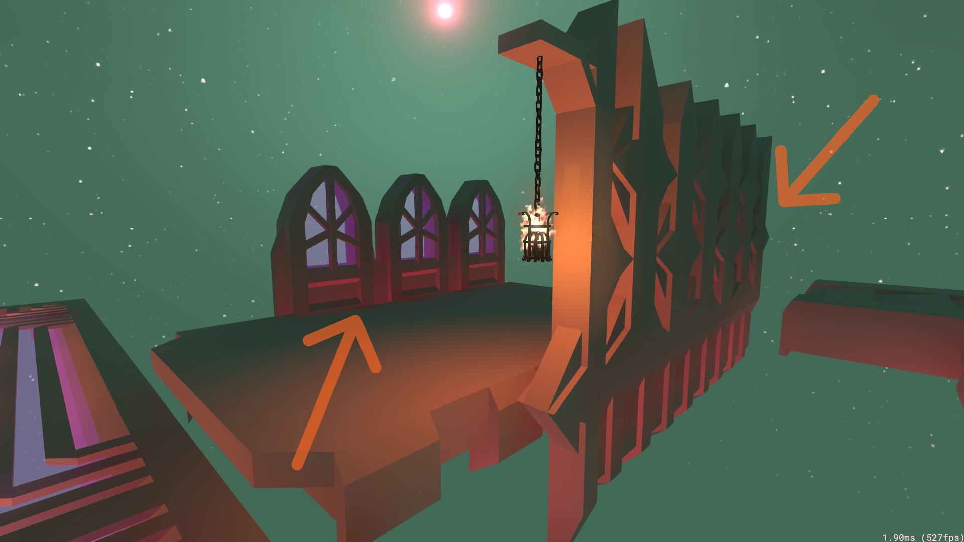
On Desanctify, I knew I wanted a gothic aesthetic, but I didn't want to kill myself with creating a massive, ornate cathedral that would take 200+ hours to detail. Instead, I resorted to 5 little "exhibits" that embody what I would consider gothic elements and scattered them around the map.
On more complicated maps, I often use the exhibits to "tell a story" about the maps. They create something interesting for the background and usually make the space less boring. They also distinguish the areas from each other so it doesn't feel like you're running around in a circle.
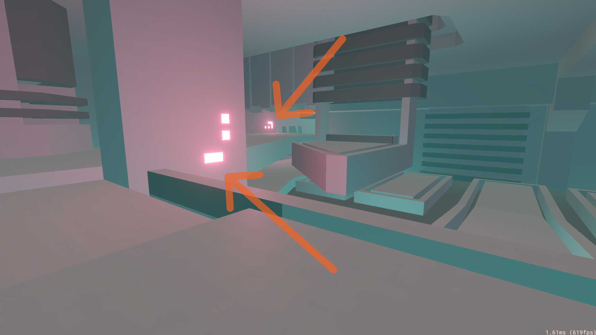
Finally, lead players with some visual cues. This is most painfully obvious in maps like CRSTL and DRGN Runner where I very intentionally put lights in places that will lead you to the end. But in many maps, I'll use point lights or other shapes to draw the attention to paths on the map.
I hope someone finds some value out of this little mapping guide.
-lolograde